Friday, 14 December 2012

Boyz N The Hood


Boyz N The Hood

Boyz N The Hood is a movie about the problems encountered by young black males living in inner-city Los Angeles. The story chronicles the high school life of three friends, two of which are brothers and one of which is the main character. Ricky and Doughboy are the brothers who live in a single-parent home. Ricky is an All-American football player who has plans of going to USC. Doughboy lives his life in the streets, selling drugs, participating in violent crimes, and drinking. Tre lives with his father, who is a strong influence in his life, but maintains contact with his mother. Furious, Tre's father, teaches Tre how to be a strong black man who has goals and takes responsibility.


This
movie is old, but the themes are still prevalent today. The movie opens with the quote, “1 in 21 American black males will be a victim of murder. Most will be killed by other black males.” This is the main point that John Singelton, the writer, is trying to convey. The black struggle starts within the black community. The black community brings itself down in many ways. Because of this, society doubts them and writes them off. This isn't fair to the black people like Ricky who are trying to do the right thing but are brought down by the negative stereotypes that surround entire race. This is symbolized in the movie when Ricky is unexpectedly killed. Coincidently, he was killed by another black male.
The key conventions of this film trailer are that it has a voice over sad music to connote death and crime.

The film poster has many key conventions like the release date at the bottom the title and the production blur just above the release date.

Friday, 7 December 2012

Anuvahood


Anuvahood

The film poster’s key conventions that it has a clear obvious title at the top third of the poster, also it has the main characters on the image of the poster. ‘A Film by Adam Deacon’ this is put there because Adam Deacon is popular in starring in the film genre of urban British comedy like ‘Kidulthood’ and ‘shank’ The poster has the two main characters which are ‘Kenneth’ and ‘Tyrone’ bigger at the front of the poster and the less important people in the background. The production blurb is also put at the bottom of the poster which is a main key convention of a film poster.
anuvahood-film-poster.jpg (570×427)Anuvahood is an urban British comedy. It tells the story of Kenneth, a failing wannabe MC who turns to dealing weed after quitting his job, and is pressured in to supporting his family when the bailiffs turn up to remove their possessions. He is followed around by his ‘crew’ of four friends who are over-shadowed by the resident bully Tyrone.
So... Is it really that simple, or is Anuvahood "just-anuva" film that encourages and enforces negative stereotypes segregating the black population and teaching our youth that these stereotypes are not what we should live by?
In the film trailer it has many key conventions like release date also it has the tagline at the start of the film trailer. The production blurb is put at the end of the trialer and at the bottom of the film poster.

Think Like A Man


Think Like A Man!
Think like a Man is a romantic comedy. Four friends conspire to turn the tables on their women when they discover the ladies have been using Steve Harvey's relationship advice against them.
The film trailer has most of the key conventions for example it has a voice over which is very rare these days because it is found as an old fashioned way. The main known/famous characters are put in the film trailer. The production blurb is put at the end of the film trailer with the release date.
The film poster here on the right has nearly all of the key conventions like the tagline at the top ‘let the mind games begin’ the tagline instantly attracts the reader/audience because of the readers/audiences curiosity of knowing what it’s going to be about. The production blurb is also put at the bottom of the film poster also the main/important characters are put in the middle of the film poster. The release date is put at the bottom of the film poster with the production blurb it’s not very precise because it says ‘SPRING 2012’ because it still hasn't been confirmed fully but it still gives you an idea of when it’s going to be coming out.
The representation in the film is very strange because the majority of people acting in the film are black people and it puts them across as very respectful middle class people. You can see this by the way they’re dressed because most of them are wearing suits and shirts. This is an American movie that’s why black people are seen like that but in British movies you rarely see black people wearing suits and being portrayed as middle class people.

Thursday, 6 December 2012

The Hangover


The Hangover!

The genre of hangover would definitely have to be a comedy movie. Hangover is rated 15 because of the content, there is violence and harsh humour. Both of these films have a similar kind on humour but one has a less concentrated kind. Looking at the hangover’s age limit, the target audience would be young teens and the majority would be male because of the content of the plot. 


The film poster carries many key conventions like at the top third of the film poster it says 'From the director of old school' this is put there because old school is a very good and popular movie Also, the release date of the movie is at the bottom of the film poster to inform the reader/audience.

Tuesday, 4 December 2012

My Magazine!


For my first assignment in media we were given a task which involved creating a magazine cover which would be given away with the I newspaper and had to be targeted for young people. Above is a copy of my final piece-I-Succeed.

Monday, 3 December 2012

Kidulthod

Kidulthood


I chose this Kidulthood trailer as it represents a variety of different people boys,girls,teenagers and many more. The main people represented are teenagers they are portrayed as negative role models because this contains money,sex,drugs and violence.
There is a lot of violence shown in this film, mostly revolving around guns and knives. The teenagers use their violence to get what they want and do not seem to know another way of going about it.
The events in Kidulthood seem to focus around drinking, drug taking and promiscuous sex. This is a very typical stereotype of teenagers today as they are portrayed in the media as all being alcoholics and drug addicts and being very promiscuous. However it is a very general statement to make that all teenagers are like that, when in reality it is only a select few that give all of them a bad name. It is shown in the film because the characters are going through the time in their lives where they are experimenting and experiencing new things. They are approaching adulthood; a link to the title of the film; which means they are wanting to act older.
In this film we can see a clear divide between the teenagers who all belong to different social groups. Within these groups there is always one person who is in charge and everyone else follows them and does everything they want. This shows how easily influenced teenagers are and how much they give in to peer pressure. There also seems to be one group that has authority over all the others.


There are a lot of misconceptions about teenagers shown in this film. In a scene where one of the characters is trying to hail a taxi, none will stop for him. Later on, a group of friends resort to using a girl to get a taxi to stop for them as otherwise the taxis would just ignore them. Once they are in the taxi they disrespect the driver by running out without paying.

The film poster above has all the key conventions of a film poster like the production blurb and all the main characters on the central image the tagline is put at the top third of the poster which is 'powerful, moving and unforgettable- kicks the door off it's hinges' this is a very snappy quick catchy tagline.


Wednesday, 10 October 2012

Magazine Cover Analysing Tasks


nME-

This magazine focuses on rock and pop. The artists featured on the
cover are RIhIanna, Lilly Allen and Lady Gaga and so on. The target audience is young teens up to late 20’s.

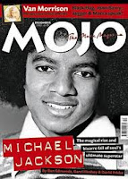
MOJO-

this magazine focuses on rock and punk the artists on the cover are michela jackson, the beatels and many more. the target audience is at older people such as early 30’s to 50’s.


vIBE-


This magazine focuses on rap & hip hop this is a new updated today magazine it features a lot great artists like lil wayne,drake,crhis brown,trey songz and many more. the main target audience for this magazine is mostly teenagers but it could apply to young adults in their mid 20’s.